
••
METUB NETWORK
The leading talent network in Asia
As Youtube’s official partner in Vietnam, METUB Network is the leading digital content ecosystem for Vietnamese Content Creators. In 2017, they successfully raised more funds from WebTVAsia, one of the fastest-growing Asian companies in the field of entertainment, digital media production and distribution. Since then, Metub has strengthened and developed their multi-channel content creation network faster to connect numerous content creators’ universes. Achieving a series of remarkable success, Metub shares their aspiration to accompany young and potential talents and shape their great future in a brighter universe. Therefore, they need a brand new identity to transfer their new mission and story into visual elements.

••
The challenge
The colors and structure of the new logo need to represent the balance, unity as well as the passion of the creative universe, a parallel world beyond the limit of physical constant in the ordinary world. The new brand recognition should be exquisite to impress customers with the new spirit at first glance while retaining the most basic features of the entertainment and media industry as long as conveying creator souls’ secrets.
••
Our solution
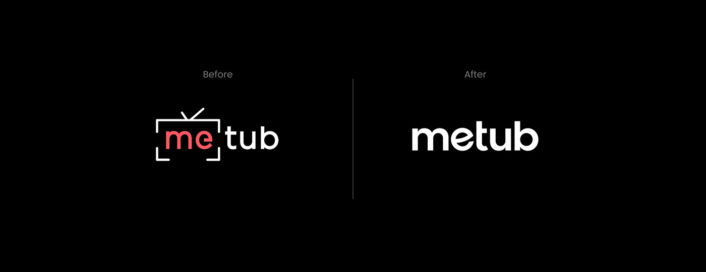
The “TV frame” together with other small details, which is creating the feeling of limitation in their previous logo version, is replaced by the simple Logotype with full of space for the infinite horizon of creativity. Bracom's changing decision not only aims at seamlessness and high applicability but also helps T.A to be easily read, recognized and memorized. The main colors of the new logo have been refined with new shades spreading more energy and stronger attraction ensuring stronger impression at first look.

••
The new logo design
Bracom is inspired by the image of the parallel galaxy as Metub is brand new universe of the content creators who are passionate about new ideas. The letter “e” is stylized to emphasize 3 factors: the spherical planet of the content creators, letter “e” in “entertainment” and a smiley face. All these elements form a parallel universe of the creative world full of energy and happiness.


••
The type system
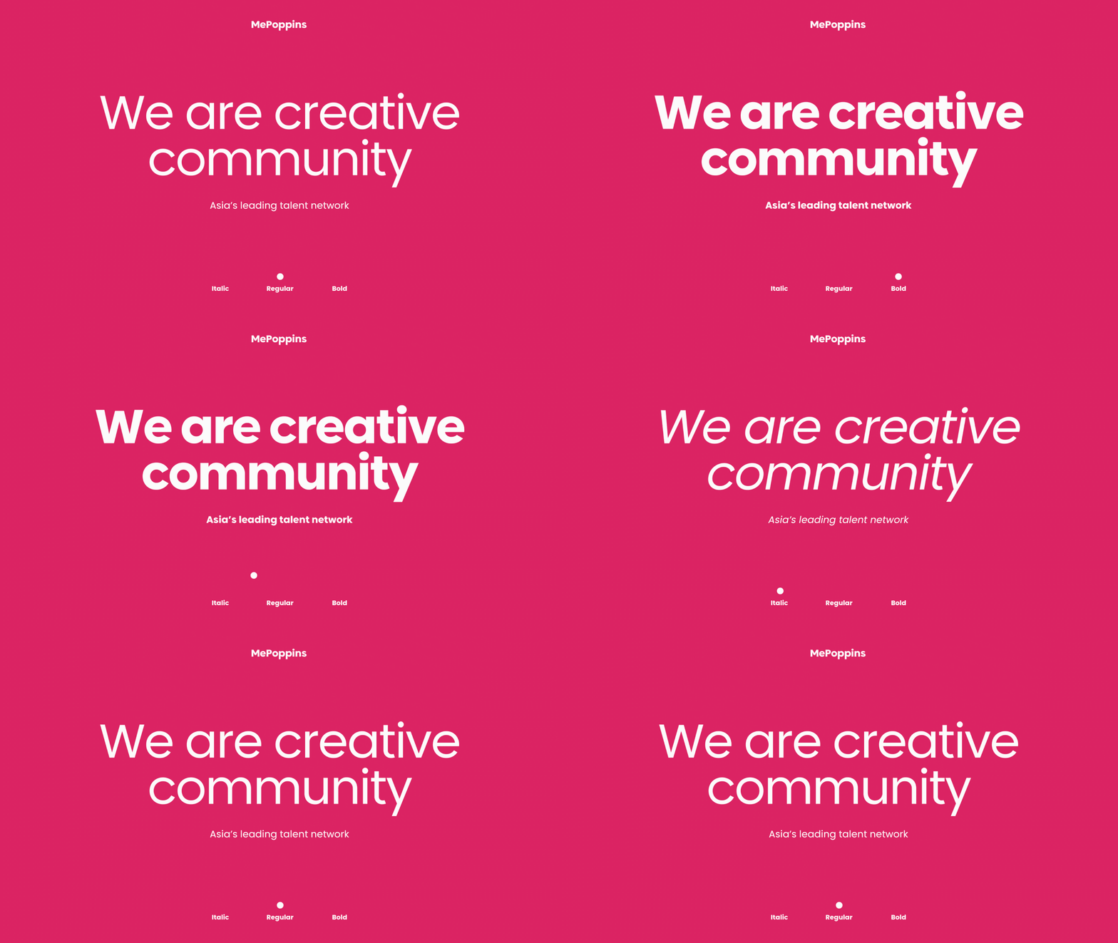
Metub’s type system was carefully considered with 3 fonts: Fellix, Euclid Circular B and Poppins. In the end, Poppins was chosen and modified to be more “open” with wide spacing and no confined feeling. Bracom has successfully converted custom Poppins to MePoppins version specifically designed for the METUB universe.

••
Color palettes
A vibrant and passionate pink, mixed with a creative and charming purple, are chosen to become the primary colors of Metub. Moreover, we add a collection of secondary colors to help create an impressive feeling as well as enhance the flexibility of the usage of the color system. We understand that colors always carry endless power through space and time, emotions and connect people's spiritual world.


••
Key visual & Pictograms
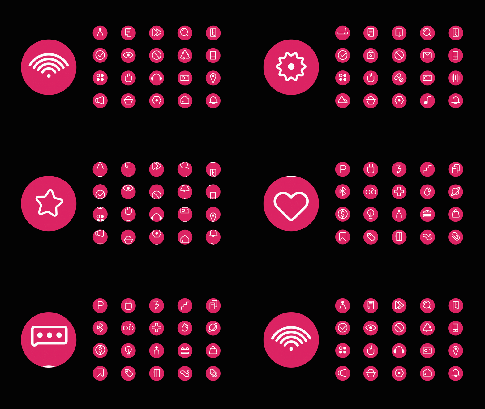
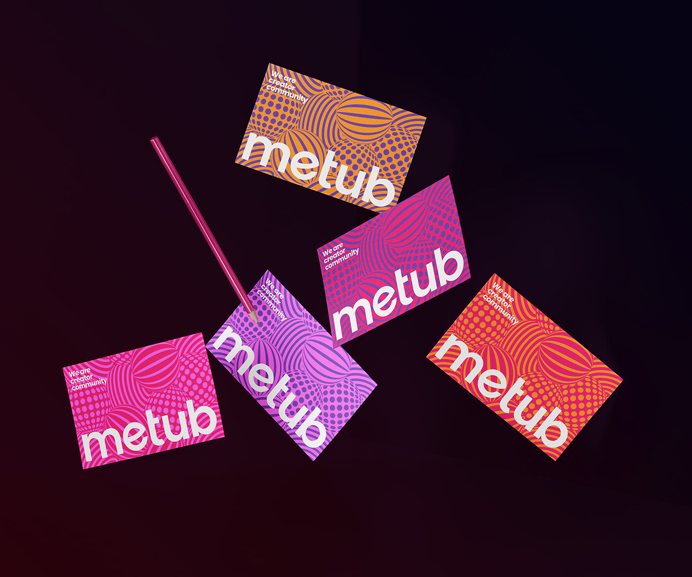
The symbol of perfection in many cultures has always been the circle. This perfect shape also represents the beauty of planets in our universe, so we continue to develop the key visual system for Metub by using the globe shape. Thematic pictograms are also designed to clarify the functions of website and application tools, as well as being a part of the signage system in Metub head office. We think of a colorful universe of endless creativity that will be in place when all of the brand applications are connected.

••
Office stationaries
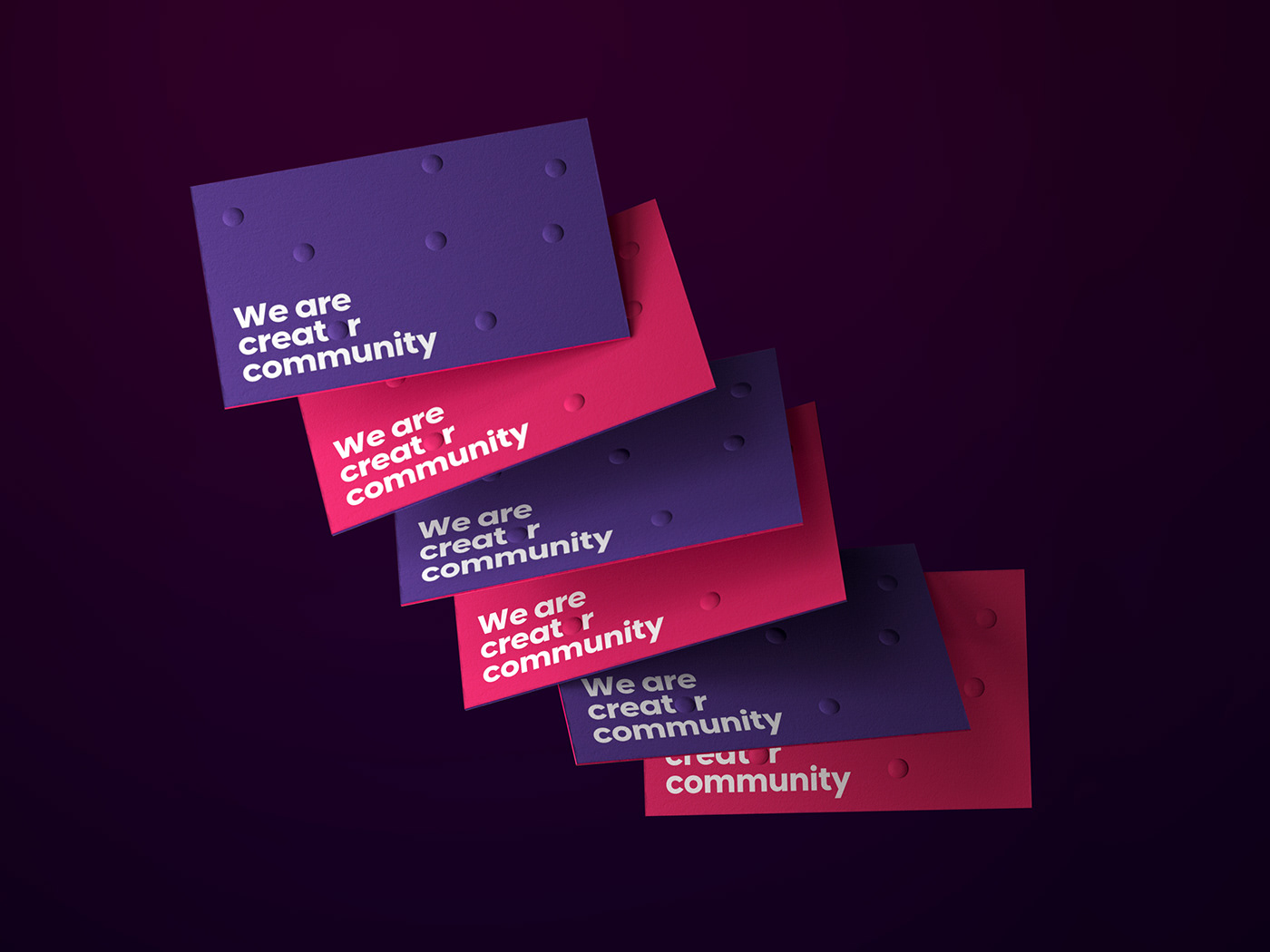
One of the main missions in this project is to create a consistent, useful and creative office stationery that supports the officers in their work everyday. By combining a set of printing techniques as embossed, debossed and silk printing, we have made an impressive stationary set for Metub.
List of items:
— Name card
— Envelopes
— Folder cover
— Staff's ID card



••
Communication design
A flexible and dynamic layout system is created to help all teams in the company adapt their content and visual elements to be more creative and easier.
List of items:
— Master layout
— Brand guideline
— Print ads
— Social posts


••
Branded merchandises
Various items of merchandise are designed and expected to be used to define the corporate culture and to share the brand's love to all Metuber.
List of items:
— Stickers
— Postcard
— T-Shirt & Hat
— Pins
— Tote bag




••
Environmental branding
We combine a number of disciplines, including graphic elements, interior items, and architecture, to translate the visual and emotive aspects of the brand into a physical space.
List of items:
— Reception
— Welcome wall
— Way-finding
— Signage


••
The mascot
Our mascot is a playful and mischievous creature who loves to chase, to play hide-and-seek in the universe of planets. Sounds familiar to you? Yes! The content creators are also hunting for creative inspiration in such "games" every day. When you see them, remember to look into their moving round eyes, the eyes can capture and create trends.
Don’t forget to praise and get them go viral.


*Some of the items above are optional versions and might be different from reality.
Thank you for watching!
— Client: METUB NETWORK
— Industry: Entertainment
— Location: HCMC, Vietnam
••
Credits
Creative director: Andy Ho
Art director: Do Trong Dat
Project manager: Van Duc Hoa
Brand designer: Huy Tang, Pim Truong, Minh Tran
Mascot: Pim Truong, Tiep Nguyen
3D visualization: Phong Le
Showcase editors: Andy Ho, Dat Do, Minh Tran
Content: Nguyen An, Tien Nguyen
Copyright © 2021 by Bracom Agency . All rights reserved
www.bracom.agency


